What makes a health coaching website stand out or create a lasting impression? Or, perhaps more importantly, how can you make every visitor understand your brand and your message at first glance?
In today’s article, we’re sharing with you 7 nutrition-focused websites by health coaches who have really caught our eye. Many of them create a memorable experience for visitors by adding special touches, like a quiz to determine if you have signs of a hormonal imbalance, and eye-catching infographics that are totally on-brand. Take a look!
1. JaclynReneeWellness.com
At a Glance:
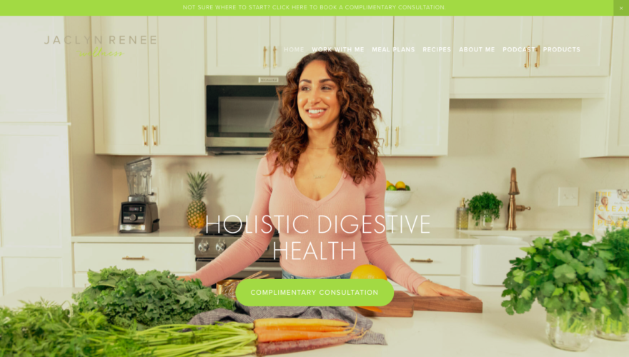
- Her primary image shouts nutrition, health, and well-being.
- Jaclyn’s business name, domain, and images show that she is her brand.
- The announcement bar and first call-to-action invite you to a complimentary consultation; and you’ll see this several times throughout her site.
What Makes it Special:
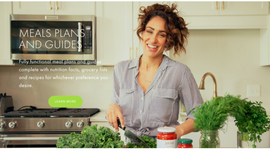
- Keep scrolling on her home page and you’ll see how important food is to her and her niche. Notice the beautifully displayed sections for recipes and meal planning.
- Jaclyn offers visitors a lead magnet—something of value when they sign up as an email subscriber—unlike many sites that ask for an email address while offering something vague like a newsletter. She offers you a quick video on her “Top 3 tips to beat the bloat.”
- She has a beautifully designed “Shopping” page that features her affiliate links and favorite companies to buy from.
- Notice, on her podcast page, Jaclyn embeds the podcast audio players so that visitors can listen to episodes without ever leaving her website.
- Most importantly, Jaclyn shares many different offers with her visitors, such as eBooks, coaching services, and various meal planning options that target specific diets or goals (Note: meal planning or nutrition laws vary state by state, so check to be sure personalized meal planning is within your scope of practice).
2. WildlyPrimal.com
At a Glance:
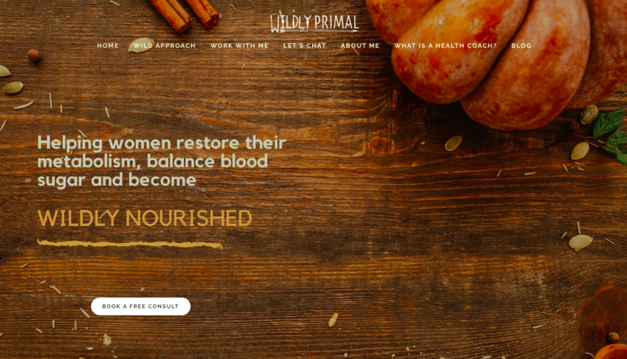
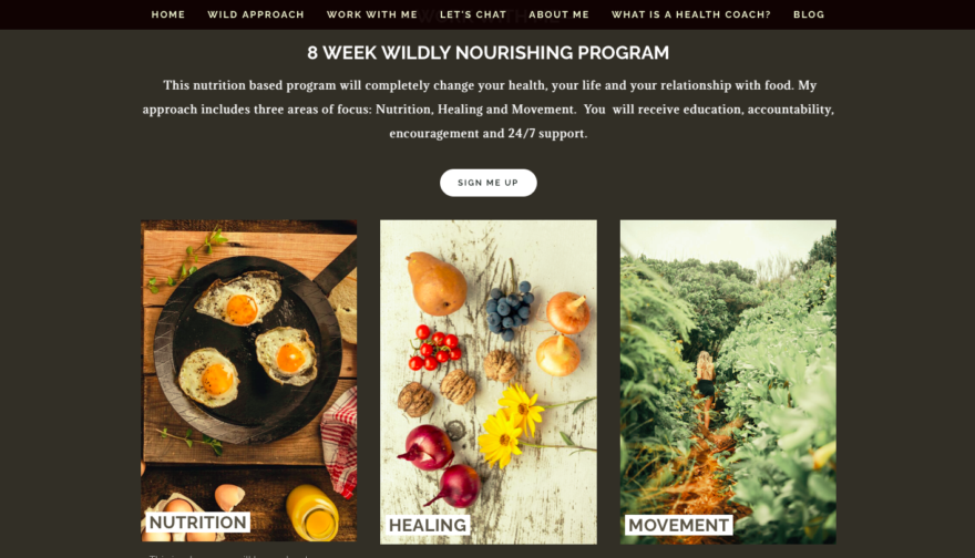
- Coach Tara from WildlyPrimal tells you everything you need to know without leaving her home page.
- Her domain/business name, design choices, and food photos give you an immediate idea about her philosophy.
- Right from the start, Tara invites visitors for a free consult (and her consult button takes you into your inbox where you’ll email her directly).
What Makes it Special:
- Tara chose menu options that speak to a visitor’s curiosities, such as Wild Approach and What Is a Health Coach?
- Most of her menu tabs, including About and Work with Me, navigate to a certain section on the home page. A simple and effective layout, keeping your most important content all on one scrolling page, and design that is offered by many out-of-the-box templates.
- As you begin to scroll, you’ll get to know if Tara’s the right coach for you because she uses emotional messaging to target her niche audience’s needs and frustrations.
- Keep scrolling and you’ll see her 8-week program and her 3 areas of importance: Nutrition, Healing, and Movement.
- At the end, you’ll see Tara embedded a feed of her Instagram Profile. This gives her another place to invite visitors and continue building that “know, like, and trust” factor.
3. CatherineWellness.com
At a Glance:
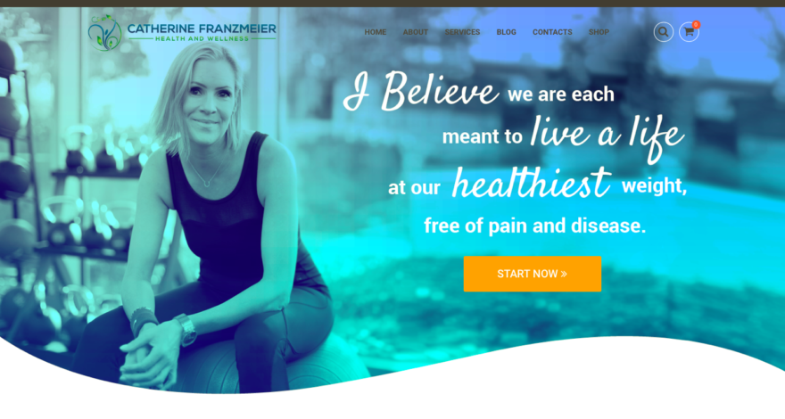
- Catherine’s affable photo is the first thing you see, along with her brand’s message and an invite to work together.
- Her scrolling home page keeps visitors engaged with clearly-defined sections and clickable topics.
- Catherine pays special attention to communicating the value of a health coach and her unique dieting perspective.
What Makes it Special:
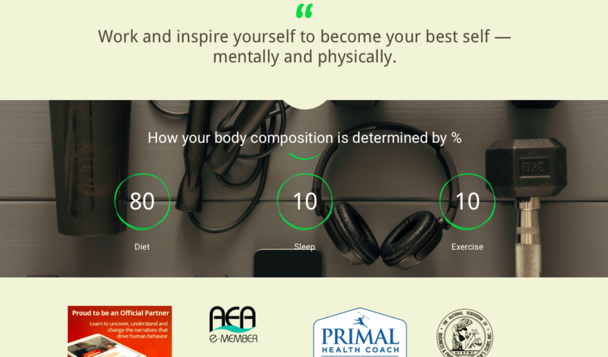
- I love this clever, animated graphic that quantifies how diet determines 80% of the body-composition puzzle (above).
- Catherine put the work in for dozens of blog posts (a key element of content marketing) that dive deeper into her philosophy and perspective.
- She offers a variety of program options with clearly distinct features, and she even emphasizes some with “best seller” text overlays on certain offers.
- Catherine utilizes her Primal affiliate products and prices by adding them to the “Shop” tab on her site
- Throughout the site, you get a real feel of Catherine’s personality and connect with her through emotion-driven content.
4. Ketology.co
At a Glance:
- With a domain name like Ketology, and everything on his site being keto-focused, it’s clear as day what Coach Becker’s specialty is.
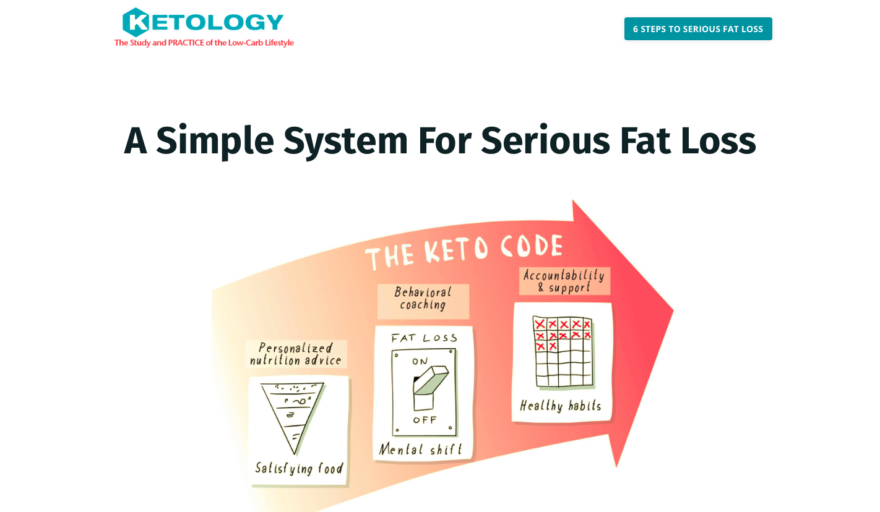
- His infographics make his brand memorable, fun to engage with, and easy to grasp.
- Right away you’ll see Coach Becker’s before-and-after transformation, (bottom right) which shows his ideal client that he’s been exactly where they are coming from.
What Makes it Special:
- I love this section: 3 Ways to Get Started For Free (above left), which provides value, hooks visitors, and keeps them engaged.
- I think Coach Becker is one of the first coaches I’ve seen offering a community to join: KetoCoders is his cleverly named tribe.
- It’s also the first coaching site I’ve seen sharing the brand’s manifesto! What’s a brand manifesto? It’s a clear set of statements that shares your brand’s beliefs, purpose, and intent. It’s 10x more authentic than a mission statement.
- His testimonial page is incredible. After seeing the mix of client videos, dozens of before-and-after transformations, and screenshots of actual reviews, how could you not want to work with him? He even shares screenshots of client progress on smartphone apps and health trackers.
- His invitation to work with him says, “Become our next success story.”
- Coach Becker offers 3 coaching options to meet all client preferences and budgets: group coaching, a self-paced online course, and 1:1 coaching.
5. SoFreshNSoGreen.com
At a Glance:
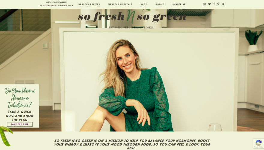
- Everything fits the brand, from the domain name to her clothing, fonts, and messaging.
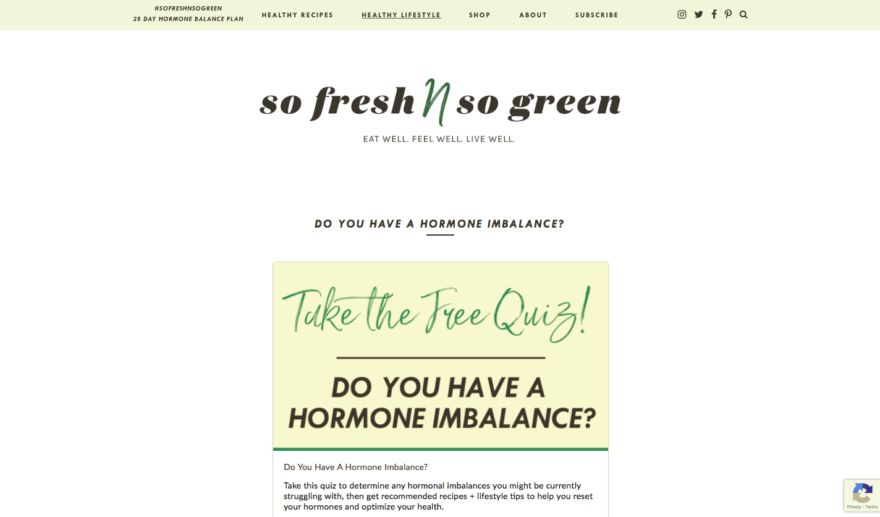
- She created a niche quiz for her ideal client, and it’s impossible to miss above the fold on her home page.
- Lauren specializes in hormonal balance for women, and it’s clear throughout each part of her website.
What Makes it Special:
- Did I mention the quiz? Yeah, that’s special.
- Lauren’s site is packed with free content. Recipes, infographics, food guides, and free eBooks.
- She also sells an eBook to address her ideal client’s top concerns.
- Head over to Lauren’s “Shop” tab to view everything from supplements to baby must-haves.
- She designed a professional media kit that you’ve just gotta see.
- Her nutrition philosophy page includes FAQs like What Is a Health Coach? or How Does 1:1 Coaching Work?“
6. ElyseWellness.com
At a Glance:
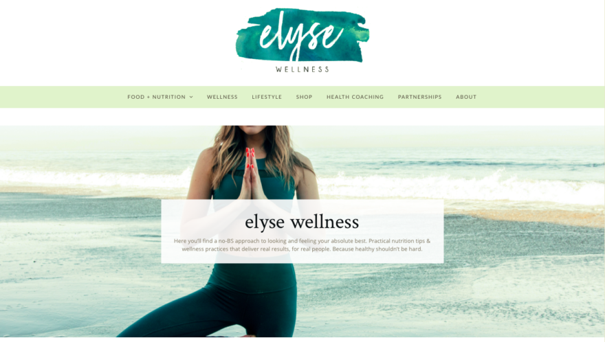
- You know right away you’re getting a No-BS approach to looking and feeling your best—from a coach who looks and feels her best!
- Amanda Elyse is her brand, and you feel like you know her just from visiting her site.
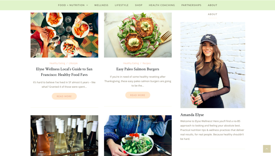
- Her homepage is dripping with recipe photos that make nutritious foods look drool-worthy.
What Makes it Special:
- Amanda offers enticing content like her Local Guide to Healthy Favorites and The Ultimate Wellness Holiday Gift Guide.
- Her “Recipes” tab also includes a “Healthy Eating” tab where she shares meal prep ideas, her favorite clean wine, and why to pack a lunch (just to name a few).
- You can see how current Amanda’s content is with articles and recipes relating to current times like Working From Home and Quarantine Living.
- She really lets visitors in with her vulnerable blog posts like My Therapy Experience and Why Living Alone Is the Best Thing.
- Amanda’s “shopping” page has a minimalist design that displays her favorite paleo/keto products in a beautiful scrolling format.
- She’s more than a health coach, she’s a millennial influencer and social media strategist. Get inspired by her “Partnerships” tab.
7. HealthCoachKait.com
At a Glance:
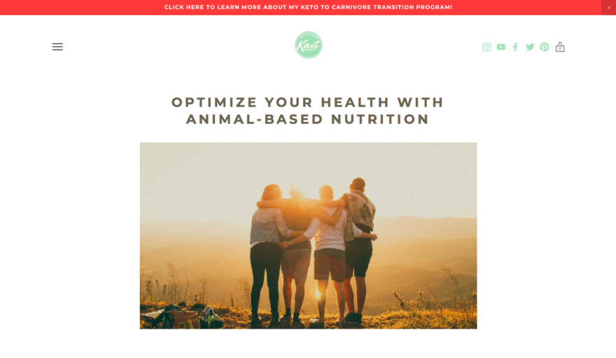
- Kait’s site has an announcement bar at the top offering up her niche program.
- Right from the header you know what Kait’s about: animal-based nutrition.
- With just a peek beyond the page’s fold, you’ll see testimonials from happy clients.
What Makes it Special:
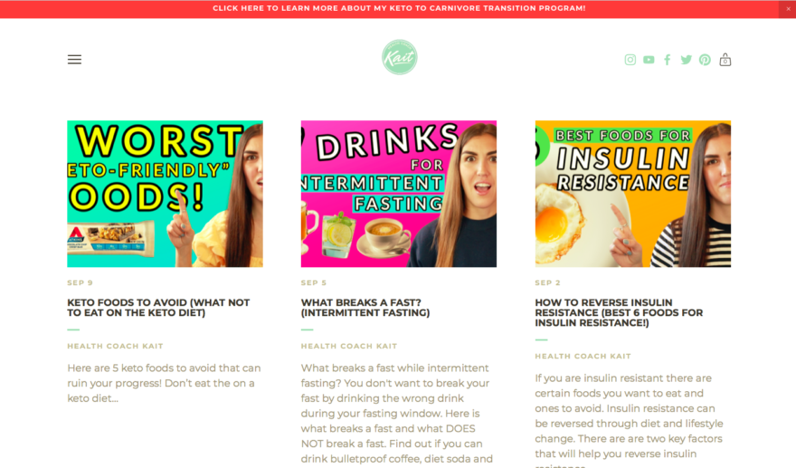
- Kait has a thriving YouTube channel (54K subscribers!). You can’t help but stay engaged on her video page because the videos are embedded right there, and she designed awesome cover images.
- Her blog is packed with posts that answer concerns and curiosities in her niche.
- I love the design of her products page…floating images of her favorite keto/carnivore goods.
- She created her own niche apparel! “Butter is for steak, not bread.”
- Kait offers two affordable coaching programs—and has dozens of testimonials to show for it.
What is it that you’re excited to add to your website now? I’m ready to up my testimonial-game and share my brand’s manifesto. We can’t wait to hear your ideas, so join us in the Health Coaching Success Facebook group, and start the conversation with aspiring coaches like you.
Looking for a play-by-play for how to get started building your own stunning health coaching website? The Primal Health Coach curriculum goes into comprehensive detail on this as part of our business building features, and we’ve also outlined the fundamental steps to get yourself started in this article, How to Build an Irresistible Health Coaching Website.
