Building a beautiful website is no small feat as a new health coach, and we are thoroughly impressed with the lineup featured here today. The following websites come from coaches who’ve rooted their brands in Primal philosophy, and we’re proud to say that every one of them is a PHCI graduate.
What will you do next to make a lasting impression with visitors on your website? Get ready for some great inspiration…
1. Primal Wife Happy Life
At a Glance:
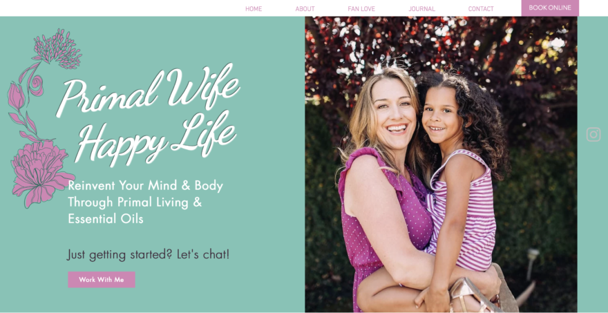
- Right away I can’t help but notice the beautiful way Dana’s brand colors, clothing, and images match so well, and they accentuate the feminine nature of her brand.
- Notice the invitation to “Work With Me” in a call-to-action (CTA) button, right at first glance.
- I appreciate how she created something like a tagline to summarize herself in one sentence: “I’m Dana, a wife, mom, believer in Christ, California native, certified primal health coach, and doTERRA wellness advocate.”
What Makes it Special:
- Dana builds intrigue and familiarity by explaining the personal significance behind her business name: “That name has a ton of meaning for me as I was not always primal, a wife, or happy…”.
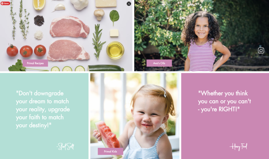
- Stylistically she’s made some great choices, like the simple text graphics (pictured above) you’ll see as you scroll down the home page—pale teal and orchid pink provide backdrops for inspirational quotes that give voice to her coaching perspective.
- The use of her (adorable) kids’ photos, along with CTA’s like “Primal Kids,” is perfect for her brand. Click through and you see a relevant sub-headline, “Raising Primal Kids in a World Full of Sugar.”
- Several more not-to-miss elements: Dana created beautiful graphics for her testimonials, she refers to her blog as a “Journal,” and the home page features 3 ways a visitor can explore her free offers.
2. Primal Peak
At a Glance:
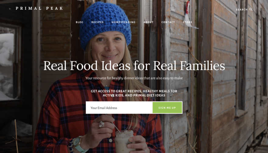
- You know exactly what Primal Peak is about with the headline: “Real Food for Real Families.”
- Notice how Shannon kept the design simple by using content blocks that link to other pages on her site. This makes everything look professional, clean, and aesthetically pleasing.
- It doesn’t take more than a few seconds to know that Shannon and Primal Peak are truly down to earth.
What Makes it Special:
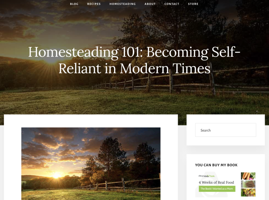
- The homesteading page (wow), the blog and recipes, it’s inspiring how much value Shannon gives her readers. It reminds me of the old blogging days—useful information that’s plentiful, organic, and full of lively wisdom.
- Shannon wears many hats, and instead of focusing her website on services she offers, she focuses on building that like, know, and trust factor.
- Click on the Shop tab and you’ll see some valuable paid offers that speak to her ideal clients’ concerns: Four Weeks of Real Food (meal-planning cookbook guide), Kids in the Kitchen cookbook and Eat the Rainbow Cooking Camp (video cooking lessons for kids), and a guided-journal for adults to reach their Peak Potential.
3. Primal Breathwork
At a Glance:
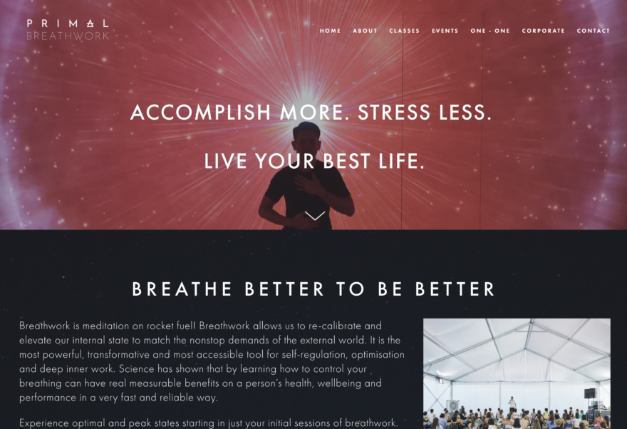
- There’s no question what Brian’s specialty is when you first land on his site thanks to his business name, Primal Breathwork, his headline, “Accomplish More. Stress Less. Live Your Best Life,” and his tagline, “Breathe Better to Be Better.”
- Notice how Brian immediately explains the What and the Why, making the concept simple to grasp: “Breathwork is meditation on rocket fuel! Breathwork allows us to re-calibrate and elevate our internal state to match the nonstop demands of the external world.” The only thing missing is a button/link for his CTA, “try a session today!”
What Makes it Special:
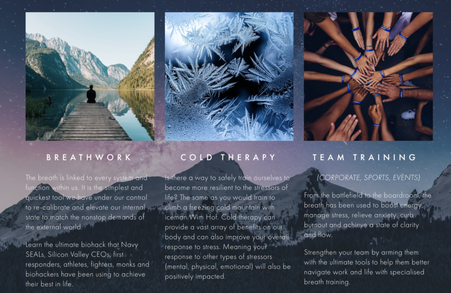
- I like the flow of his About page. In the top section, he explains breathwork, and in the next section, he tells his own story. Finally, he displays all of the world-renowned instructors he has been trained under (he’s one of the first certified instructors under Wim Hof!)
- Take a look at his classes tab for a beautiful clean layout that not only lists his events, but also leads curious visitors into his corporate wellness and one-on-one offers.
- With all of the event photos on every page, Brian is demonstrating social proof because we can see he is busy in his field and his classes are full.
4. Primal Alternative
At a Glance:
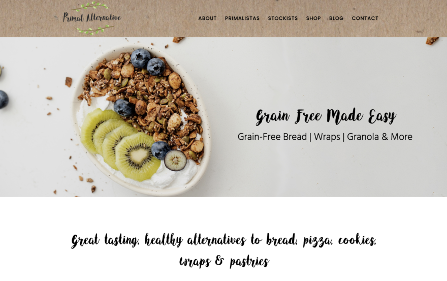
- I know at first glance that this company specializes in “Grain-Free Made Easy,” which is immediately followed by “Great tasting, healthy alternatives to bread, pizza, cookies…”
- Helen does pop-ups the right way. Offer your audience something they want, and be sure the pop-up doesn’t keep appearing on every page. Free Recipe eBook from Primal Alternative? Yes please!
- I’m captivated by the drool-worthy food photography on this website. The simplest things can be the most beautiful.
What Makes it Special:
- I adore how Helen used symbols to emphasize the dietary restrictions her food products can accommodate. It draws your attention to important values that set her brand apart: low carb, grain-free, low FODMAP, Paleo, etc….
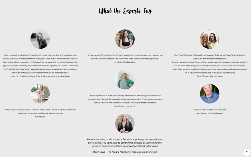
- Beautifully showcased testimonials on the home page are a great strategy to demonstrate social proof from other experts in her industry. She further solidifies her authority with a list of organizations her brand is “approved by” as well as an inventory count of the number of products they carry, home-cooks they’ve certified, countries they serve, and more. Smart!
- On the About page, notice how she tells you about the brand before she tells you about herself, which is great for a product-centric brand. Also, you’ll see clear statements that connect her ICA’s problems to her brand’s solution. “How hard is life without bread?”
- Take a look at Helen’s Case Studies page which further demonstrates her authority, experience, and real-life impact. The images and success stories of “Primalistas” really take it to the next level.
5. Peak Primal Health
At a Glance:
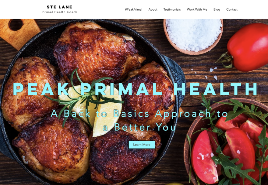
- The insanely mouthwatering food image in his cover photo makes me trust that this guy knows good food. What’s important here also is that he keeps it simple. The colors pop and the ingredients can be counted on one hand.
- Coach Ste’s header does a great job of stating his mission, “A back to basics approach to a better you.”
- Scroll right below the fold and you’ll see an answer for this question: “Why Primal?”
What Makes it Special:
- Check out his testimonials page and you’ll see detailed client stories that really come to life, and he finishes the section with a CTA button that says, “Be Your Own Success Story.”
- At the bottom of every page is an embedded contact form which is great way to remove all barriers for connecting with curious, rushed visitors.
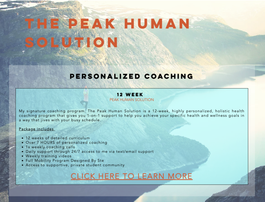
- Although his home page offers several ways to work with him, the Work With Me page focuses on his signature offering: Personalized Coaching. The bulleted list of what’s included helps add value, and he links to an in-depth digital brochure that covers all aspects of his 12-week transformation program (plus testimonials!).
6. Latitude Health Coaching
At a Glance:
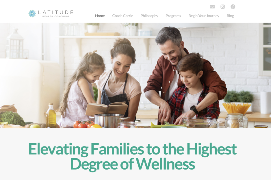
- You get that healthy-family feel right from the start thanks to the image and tagline, “Elevating Families to the Highest Degree of Wellness.”
- Right under Carrie’s headline, you see a brief overview of the company mission and a CTA button that says “Discover Our Programs.”
- Visitors appreciate the explanation for “Why Primal Works” on the home page because it piques interest and addresses possible objections.
What Makes it Special:
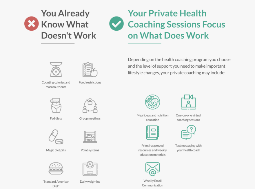
- The infographics on Carrie’s home page are awesome (pictured above). She addresses outdated dieting tactics that don’t work, and how her services offer something that does work.
- I love a good Philosophy tab, and this is where coach Carrie really dives into the Primal approach. All of that leads visitors to a 21-Day program she offers.
- The clean, cohesive design of her website comes through on every page, and it’s greatly appreciated on the Programs page where each program title is easy to understand and the features are laid out plain and simple.
Looking for more website inspiration? We’ve featured health coaching websites in the Nutrition and Fitness categories, too. Check them out and get started building your own website, next.
