
Are you building a website for your health coaching business? Updating your current one? Or maybe you’re totally paralyzed with fear because you don’t even know how to start. Regardless of where you are in the website-building process, today’s post is for you.
I’ll be sharing 35 inspiring websites from holistic health coaches and wellness experts, plus best practices for creating your own.
First off, your website should quickly and clearly communicate who you are, what you do, how you can help, and how to work with you. And as we teach in the Primal Health Coach Institute curriculum, there are also certain things you’ll want to keep in mind as you build your site, including:
- Less is more
- Offer something of value
- Consider using video
- Don’t rely on navigation
- State your unique value proposition
- Include testimonials
- Choose colors wisely
Another thing that’s important to know is that the average person has an attention span of 7 seconds. That’s it. So, while you want to share your story and all the wonderful things you do, it’s important to keep it concise. At least on your home page.
See how other health pros are putting these best practices to work, and get inspired as you start thinking about how to use these elements on your own website.
1. Balance by Molly
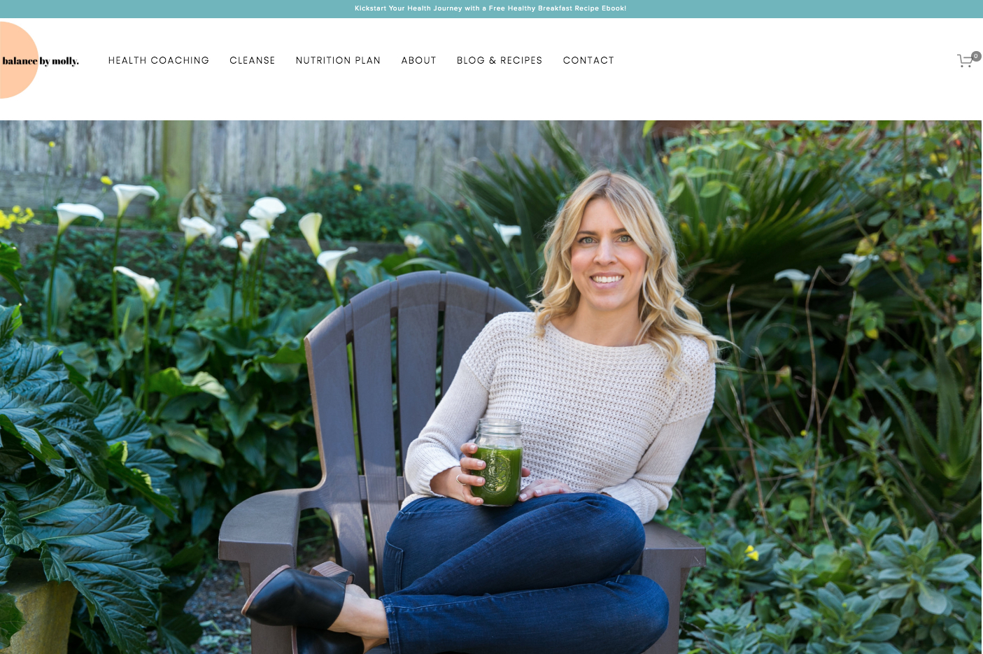
Why it Works: This San Francisco-based health coach knows that less is more. Keeping in mind the average person’s attention span, she uses large, eye-catching visuals, short succinct copy, and clear navigation on her home page. Her website makes it easy for her prospects to find what they’re looking for without feeling overwhelmed.
Who Else is Doing it Right:
6. Running With Forks
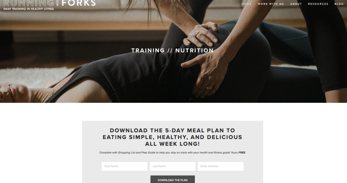
Why it Works: By providing something of value in exchange for an email address, this wellness expert has a plan in place to collect leads and grow her email marketing list. In this case, she’s offering a free 5-day meal plan, but depending on your specific niche, you might offer a keto e-book, primal quick-start guide, or a free 15-minute consultation.
Who Else is Doing it Right:
11. Simply Defined Fitness
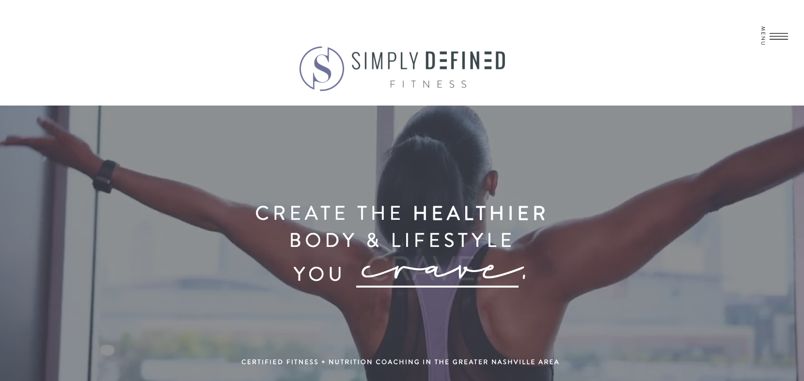
Why it works: This fitness, nutrition, and health coaching duo knows that video grabs their audience’s attention. Studies show that having a video on your home page improves conversion rates by up to 80%. And about 55% of people who watch videos stay until the end, which is more than any other type of content.
Who Else is Doing it Right:
16. Christina Rice Wellness
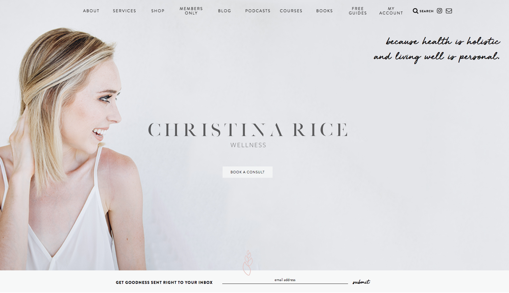
Why it works: If people visiting your website can’t figure out what to do within 7 seconds, there’s a good chance you’ll lose them altogether. This Primal Health Coach and Nutritional Therapy Practitioner doesn’t rely on navigation. In fact, she clearly tells her prospects the one thing she wants them to do right up front: and that’s to book a consult.
Who Else is Doing it Right:
21. Marisa Moon Wellness

Why it works: By clearly stating your unique value proposition (also called your UVP), visitors get a clear sense of who you work with and what you offer. If you created a UVP in the PHCI course like this Primal Health Coach did, you’re already ahead of the game. Try using it as the main headline for your home page or as a subhead.
Who Else is Doing it Right:
26. J.J. Virgin
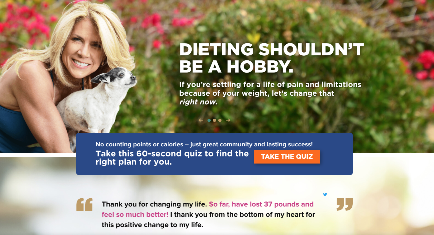
Why it works: By using real testimonials on your website, you’re giving future clients proof that you’re a reputable and knowledgeable health coach. Don’t have testimonials from paying clients yet? Consider getting ones from friends or family members that you’ve helped out during your health coaching training.
Who Else is Doing it Right:
31. Steph Gaudreau
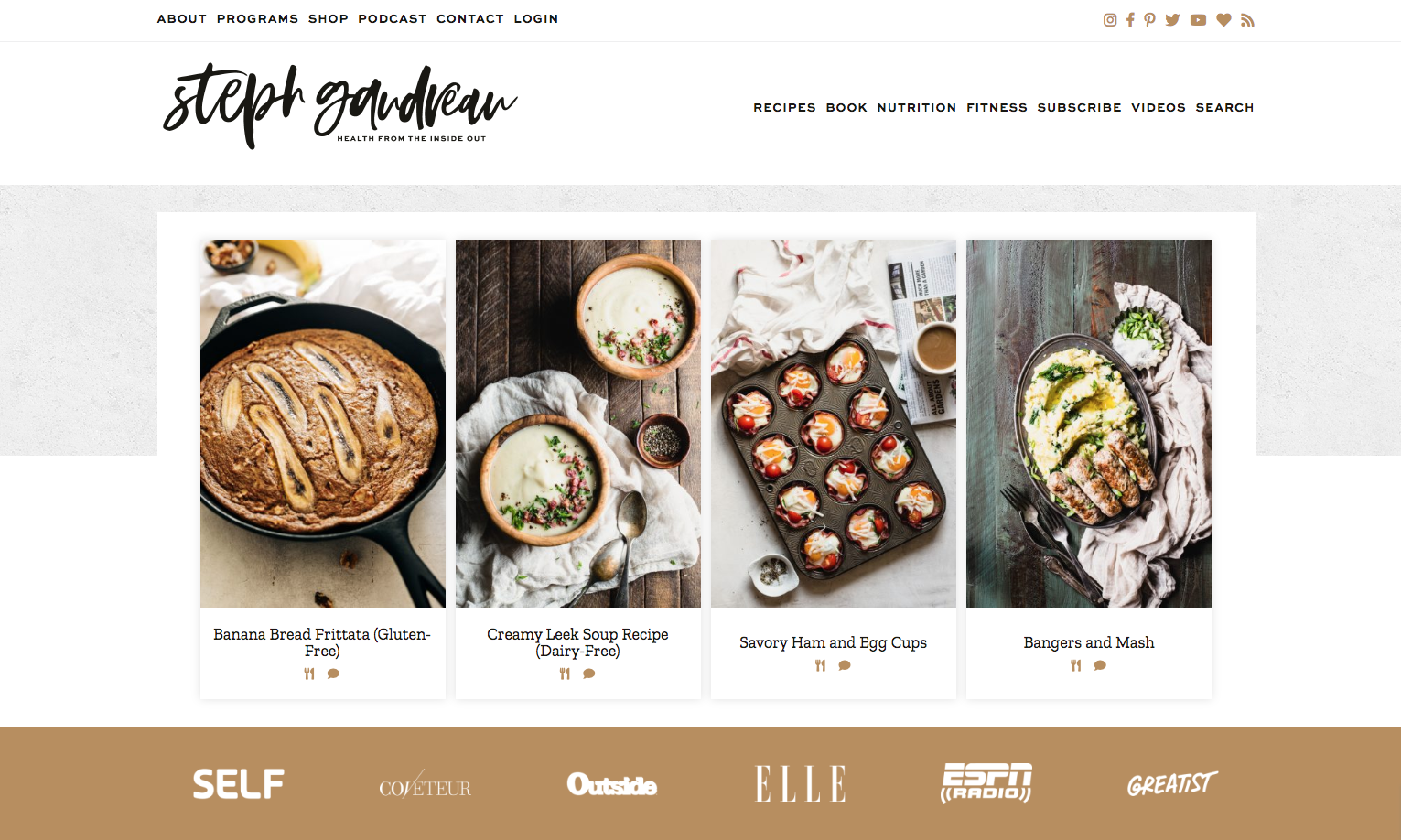
Why it Works: Choosing a limited color palette (and sticking to it) not only makes your website look more attractive, it helps create a more memorable brand. Too many colors will make your site feel overwhelming, and too few can look uninspiring. The key is to pick colors that compliment each other and use them consistently, like this nutritional therapy and strength training expert does throughout her website.
Who Else is Doing it Right:
In Summary
Having a well thought out health coaching website allows you to put your business, your personality, and your services out into the world so future clients can find you—and hire you. Remember, they need to be able to gather as much information as they can in a short amount of time, so if you’re in the process of creating (or re-creating) yours, use these 35 examples as inspiration and see how you can integrate these best practices into your own website.
