What are some simple design choices you can make on your health coaching website so that visitors have a positive impression in under 1 second? And, once they begin to scroll, what messaging, aesthetics, and content will keep those curious visitors engaged?
Today we’re highlighting 5 health coaching websites that inspire through thoughtful design and holistic wellness coaching. As you may know, it requires more than a nutritious diet or fitness to cultivate wellness of the whole body, mind, and spirit, and these coaches accentuate this important dynamic.
Anyone who lands on these wellness websites—whether by inbound marketing or search engine optimization (SEO)—will have quite a memorable experience. Let’s take a look at what makes them so special…
1. The Mama Nation
At a Glance:
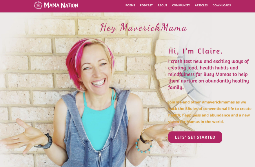
- She has a knack for catchy phrases and brand integration—#maverickmama, mama nation, and BRules—mentioned repeatedly and defined throughout her website.
- Her freebie is right below the scroll, with an eye-catching, alluring image, headline, and call-to-action (CTA): “Bust Your Stress Levels So You Can Create a Life of Amazing Moments With Your Kids”.
- It’s clear from the start that she wants you in her community called Mama Nation. She really makes you want to be a part of something!
What Makes it Special:
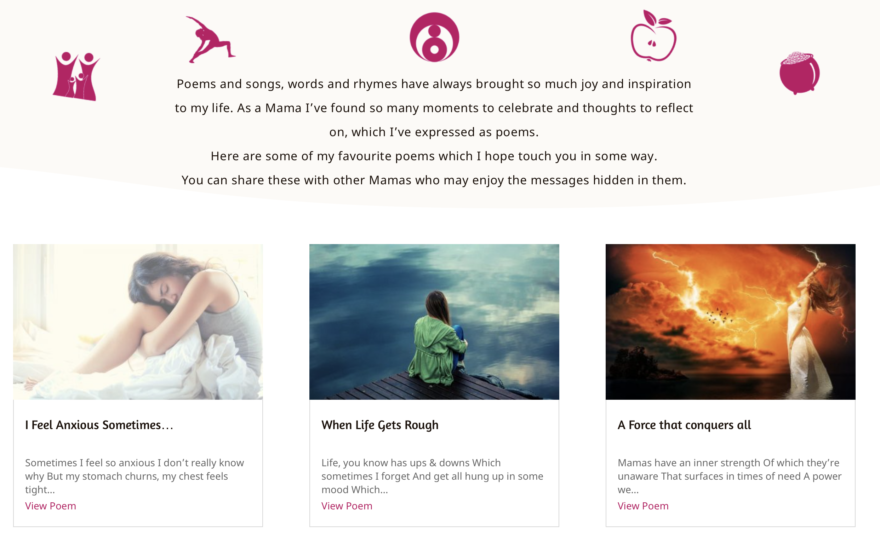
- This is the first health coaching website I’ve seen that features poetry! It’s clear that Claire is passionate about writing poems, and it works so well for her community of stressed-out moms striving for more balance and mindfulness.
- Most websites’ About pages display long, text-heavy stories that risk losing visitors’ attention too soon, but Claire did things differently. She simplified the About page by opening with an easy-to-digest summary right at the top.
- Keep scrolling on her About page, and you’ll see she defines the word “Maverick” which is an important part of her brand message and community hashtag #MaverickMama.
- Start reading Claire’s bio and you get the feeling that she knows exactly where you’re coming from as a stressed mom who struggles to find herself and balance it all. She’s authentic, willing to be vulnerable, and challenges the norm.
- On her Podcast page, she entices visitors with a CTA, “Join the waitlist,” where you’ll be the first to know when new episodes are published. What a great strategy to build anticipation for her upcoming show: The Mama Nation Podcast.
2. That Wonderful Feeling
At a Glance:
- With this beautiful image on the intro page, AKA splash page, coach Muskan Taurani truly captures the feeling behind her business name. How wonderful it must feel to lie there in the grass and sunshine without a care in the world!
- Her home page greets visitors with thumbnail images that entice and help navigate directly to her top pages: About, Recipes, Coaching, and Blog. This is a neat idea for new coaches who have yet to create a free offer or email subscriber list.
- Scroll a bit further and you see all 4 of her offers on the home page: a free downloadable resource, an invite to a coaching consultation, and her program options—including her prices…you don’t see that often, but visitors do appreciate the transparency.
What Makes it Special:
- Every chance she gets, she shows you that her philosophy is about more than just physical health, including joy, well-being, and life balance.
- Her Health Coaching page opens with “What is a Health Coach?” which is a smart move considering health coaching is still a new concept to most people.
- Muskan doesn’t hold back in her About story. She’s honest and vulnerable, letting visitors in on the journey she took to get here and who she truly is.
3. Gro With Clo
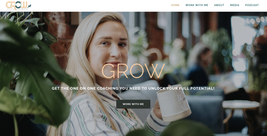
At a Glance:
- Coach Chloe Maleski’s colors and branding are inviting and consistent throughout. I appreciate the combination of colors, soft peach with deep cyan-green, a unique design choice that may just help cast a subliminal, lasting impression.
- Right away, on the primary image, she invites visitors to “Work With Me” on the call-to-action (CTA) button.
- Throughout the home page, you see “Gro With Clo” text and logo variations interspersed—a smart strategy for increasing brand recognition.
What Makes it Special:
- Right below the fold, Chloe talks about “Why Mental Game?” is essential in a holistic model for individuals and teams striving to achieve peak performance.
- Every single page of her website is accessible by continuously scrolling the home page, as well as via traditional menu navigation.
- Brilliant move embedding a new client application on the home page, Chloe. This helps remove any barriers to entry, allowing visitors to take action when instinct and curiosity strike.
- Scroll to the end of her home page and you’ll see this grid of ass-kicking gym photos that showcase Chloe’s versatility and passion for athletic performance.
4. Charlene Gisele
At a Glance:
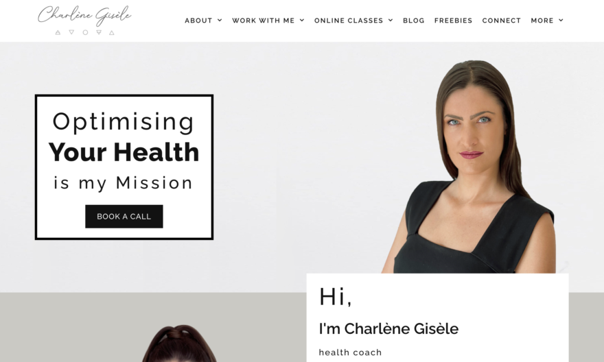
- You immediately get a feel for Charlene’s professional vibe with the clean design, black and white style, and the composed look she portrays in her primary image. I love the duality achieved with her second photo, smiling in the Primal Health Coach gear, too.
- Many new coaches are hesitant to use their name as the business name, but, using Charlene’s website as an example, aren’t visitors more likely to remember her name and see her as an authority thanks to her self-branded approach? Yes.
- Notice the CTA button right on the main image, “Book a Call.” She also shares several free resources and invitations to work with her across her entire site.
- Right at first scroll, visitors are made aware of Charlene’s niche clientele (those who work in the legal sector), and they get an idea of the deep work she does—as she is “lovingly dubbed ‘the Soulicitor.'”
What Makes it Special:
- Her About page explains the concept of “Primal Health,” which is a great idea for any primal-driven coach and website.
- We don’t see this often: Charlene displays images of herself working with 1-on-1 clients. This is a simple move that can help clients envision themselves working with her as a personal coach.
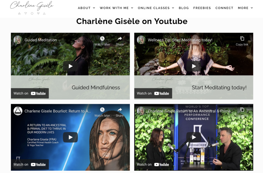
- Her YouTube section (on the Press and Media page) really demonstrates industry proof and authority in her field.
- It’s quite amazing how many resources and services Charlene has to offer her visitors. Be sure to view her Breathwork page, under the Online Classes tab, where you’ll see some effective content blocks and design ideas that make the text-heavy page easy to read and enticing to engage with.
- The “Coached by Charlene” program screams holistic wellness. Inspired by the earth’s elements, the pillars of her program include breathing techniques, fasting, cold therapy, primal eating, earthing/grounding, as well as meditation, sexuality, and sun exposure.
- And so much more…this website can captivate a visitor for hours!
Learn more about Charlene in her Primal Health Coach success story, here.
5. Christine Hassler
At a Glance:
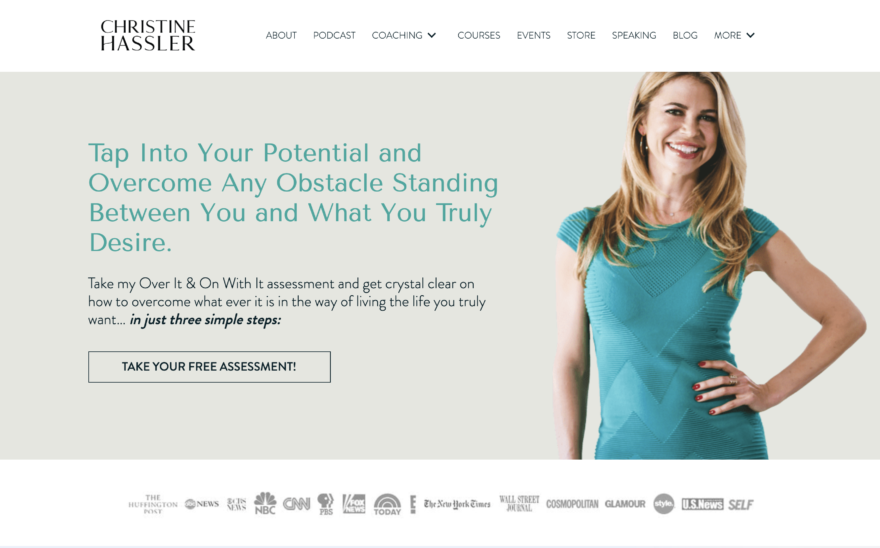
- A happy, inviting presence is generated by her photos, allowing a lively spirit to come through—and that’s precisely what you’d want in a wellness coach.
- Give subscribers something valuable: Christine’s CTA button and pop-up window offers a freebie assessment to help her ICA (ideal client avatar) get clear on their personal blocks.
- Notice the banner filled with logos of the top media brands she’s collaborated with, and be sure to visit her jaw-dropping Media page—something to inspire us all to dream big!
- All of her products, services, freebies, and courses have a place on her home page as well as dedicated menu tabs.
What Makes it Special:
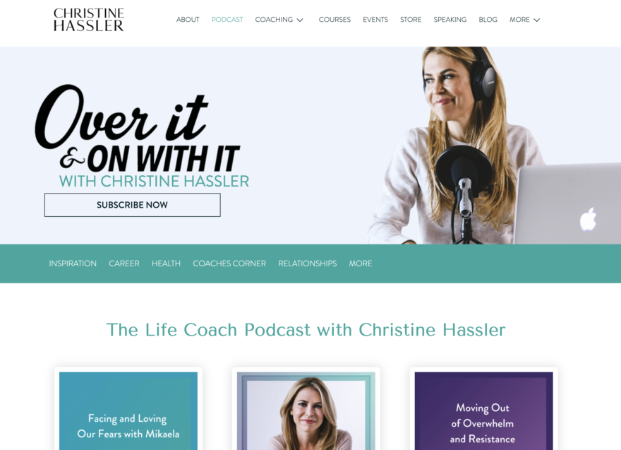
- Christine’s messaging is very consistent. Her podcast, “Over It & On With It,” shares the same title of her freebie assessment and her “personal mastery course” program.
- Digging further into her Media page, I noticed “The top 10 reasons to book Christine,” videos of her presenting in action, keynote topics, professional testimonials, and more!
- Notice the 1-minute greeting video Christine created for her Coaching page.
- Try giving visitors all of the good stuff on your home page—like you see Christine doing—so they can simply scroll to find more value as they get to know you better.
- Her podcast page has a sub-menu that helps categorize her large podcast library for visitors so it’s easy to navigate to topics that meet their curiosity. The way she dedicates a single content block per episode is visitor-friendly, too.
Learn more about Christine’s wellness approach in her interview with us on Health Coach Radio.
Looking for more website inspiration? We’ve featured stunning health coaching websites in the Nutrition, Fitness, and Primal categories, too. Check them out and get started building your own website, next.
